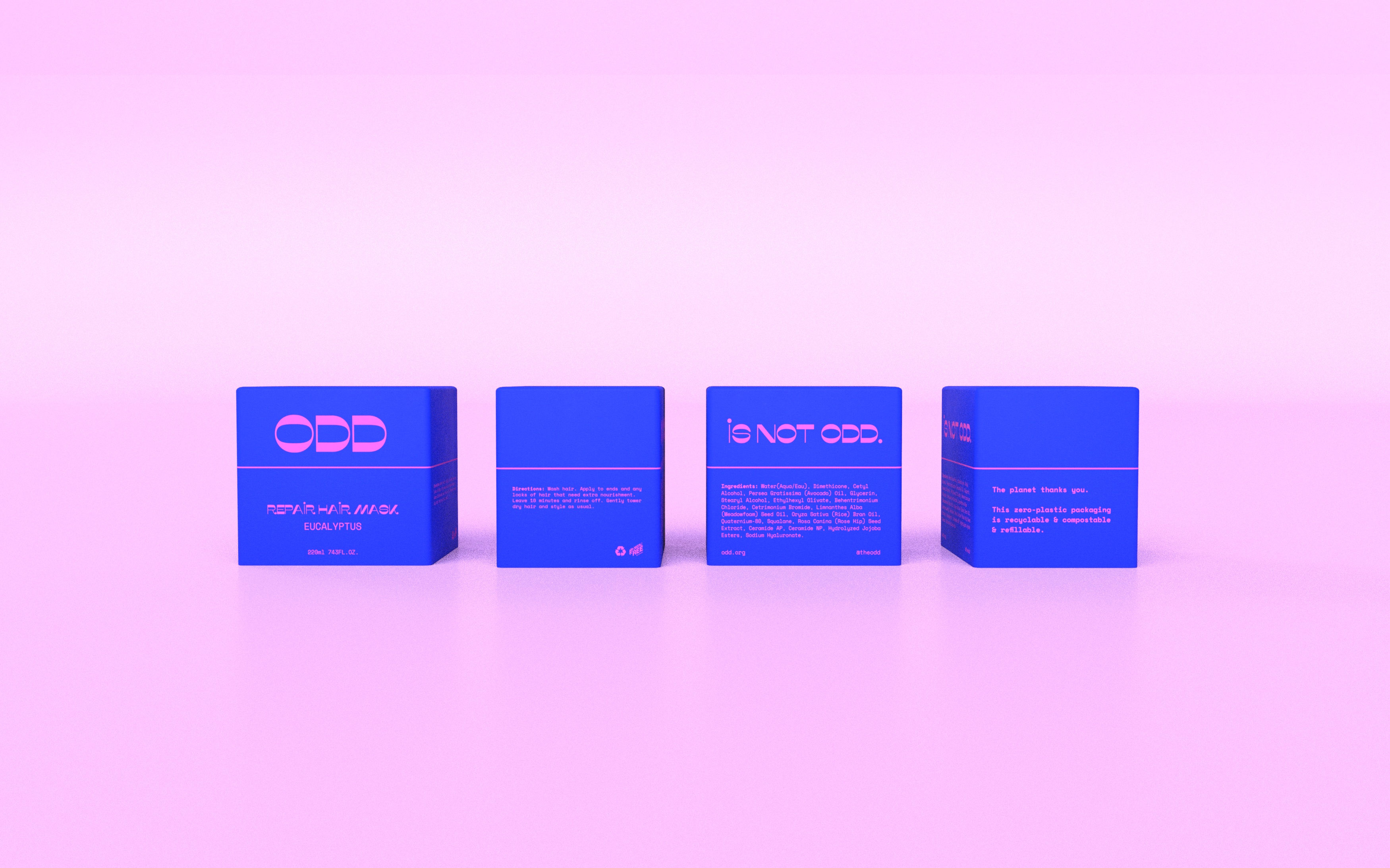
ODD
Packaging Design, Brand Identity
Personal Project, 2021
My hypothetical haircare brand ODD gave me a unique canvas to experiment with forms,
colors, and materials, with a strong commitment to plastic-free sustainability.
ODD is a plastic-free hair care product line designed to be bold, colorful, and show novelty. Our target audience is the millennial generation and Gen Z, study shows 83% of those 44 and under were willing to pay more for sustainable packaging, and most of them have not used a shampoo bar yet. I hope to use this opportunity to attract more people into the bar prevalent trend, provide a simple, innovative user experience with natural ingredients for customers, and less waste for the earth.
Mission statement:
ODD is not odd.
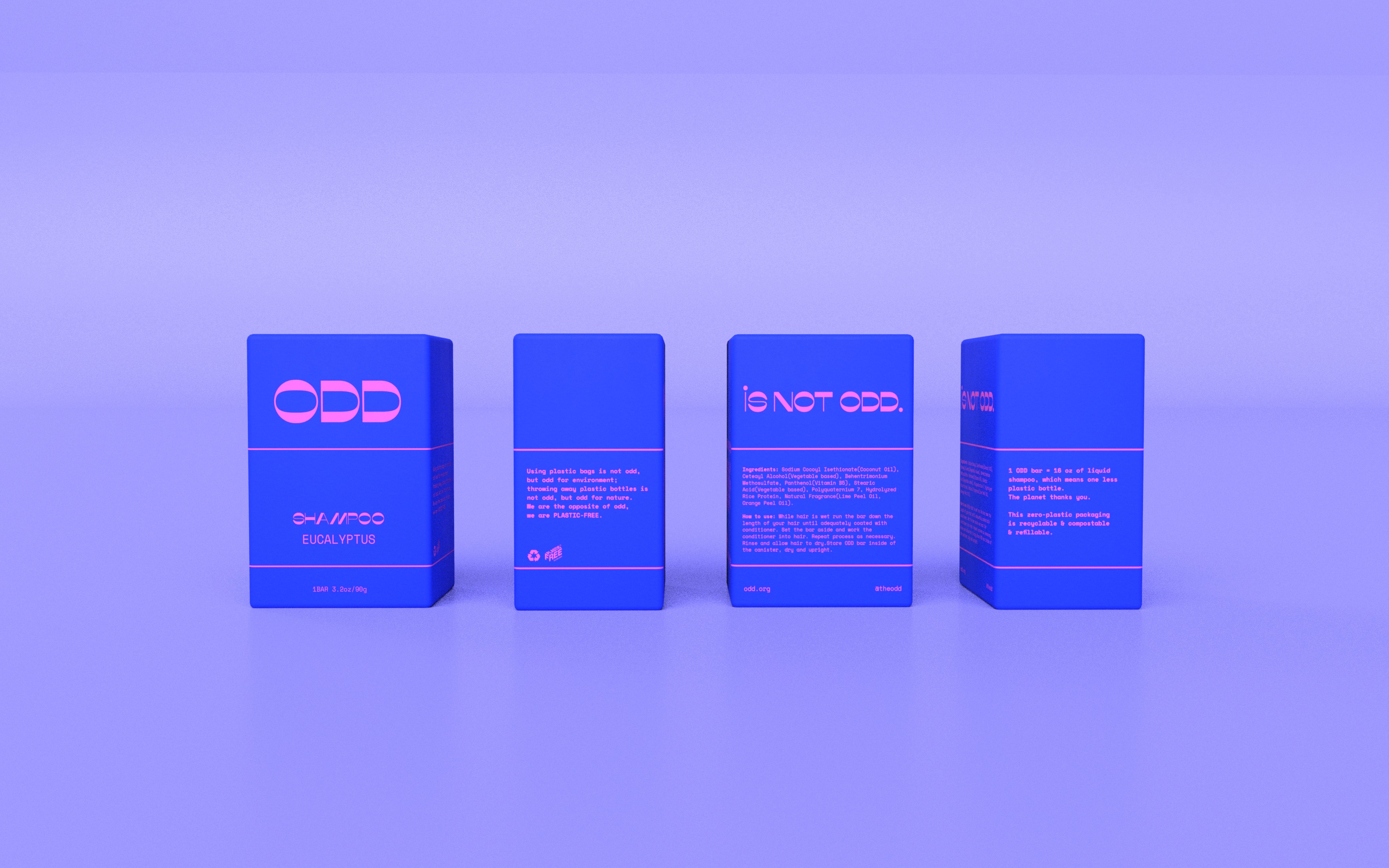
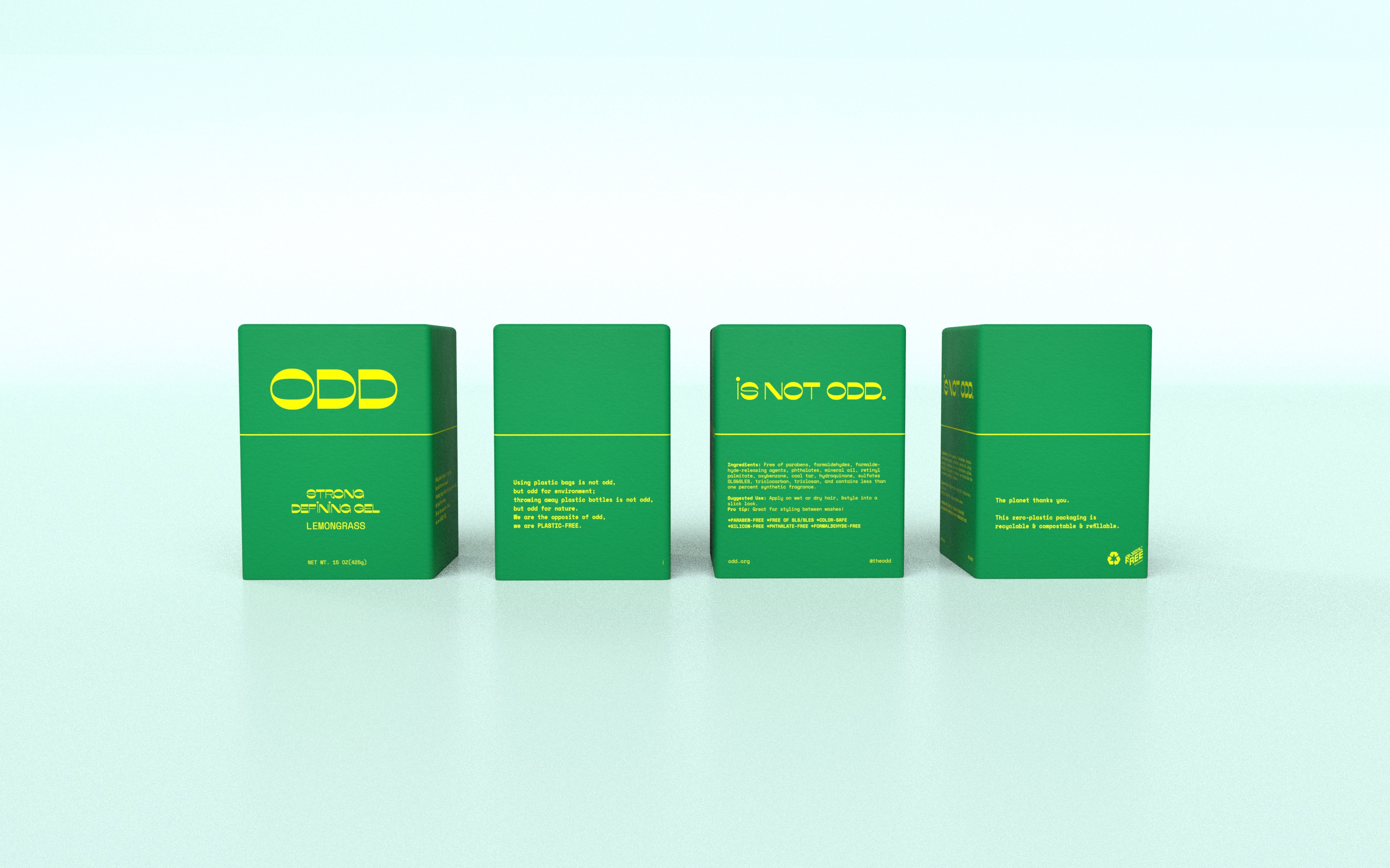
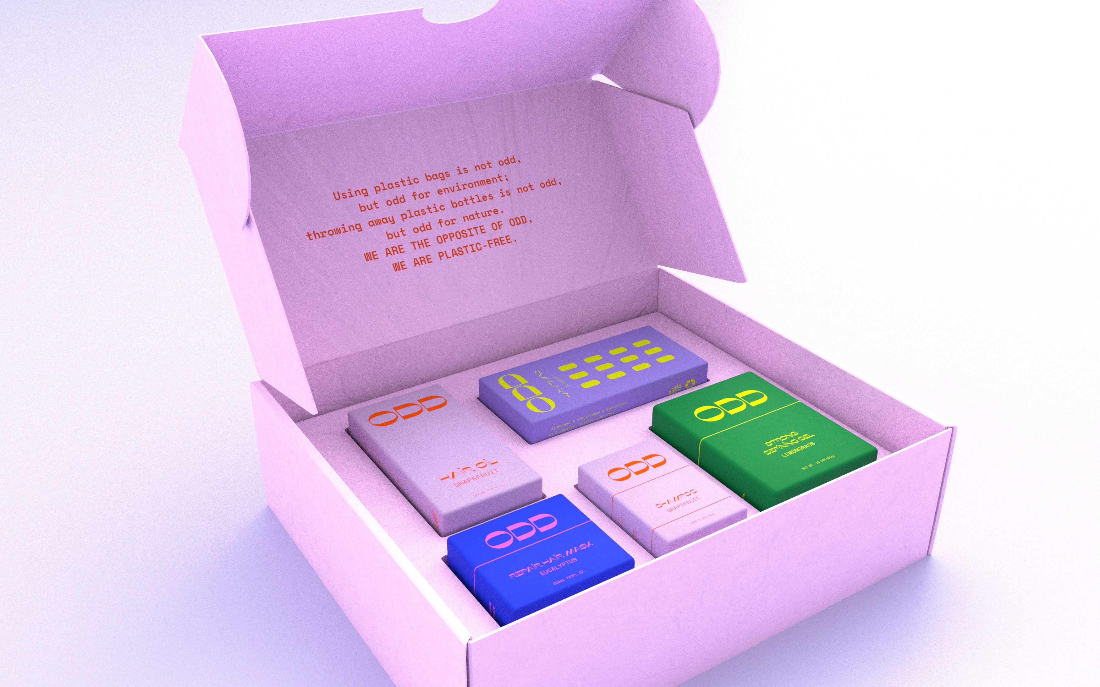
Using plastic bags is not odd, but odd for the environment;
throwing away plastic bottles is not odd, but odd for nature.
We are the opposite of odd, we are PLASTIC-FREE.
[Design process upon request]
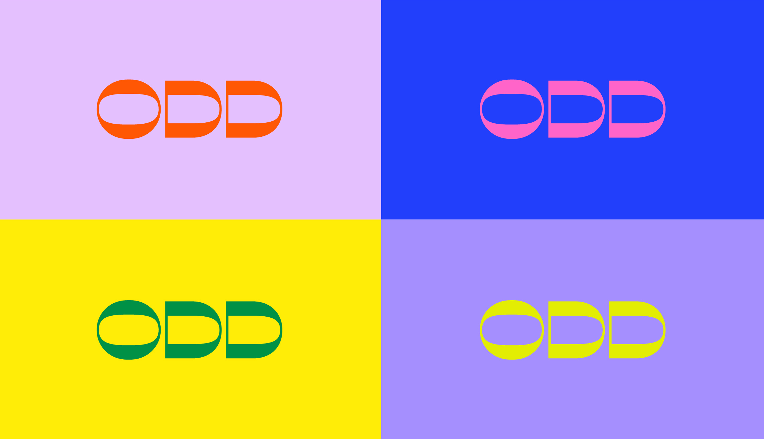
Logo Naming and Design
The brand name "ODD" was a deliberate choice, chosen to challenge the status of plastic
use and to position the brand as a leader in the shift towards sustainable packaging
practices. This project isn't just about creating packaging; it's about crafting a brand
narrative that champions environmental responsibility.
Color Palette
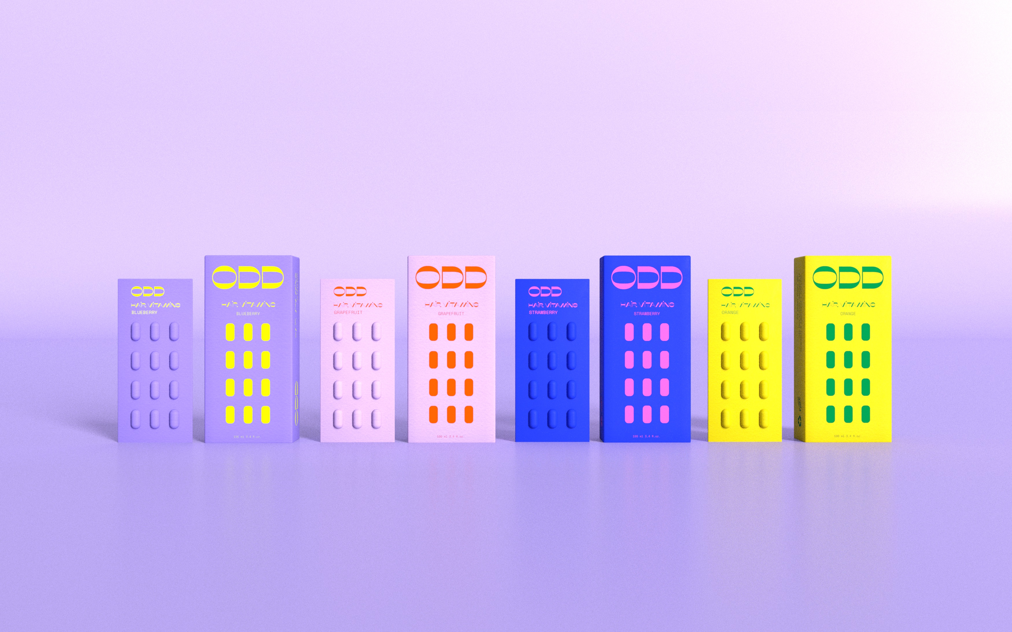
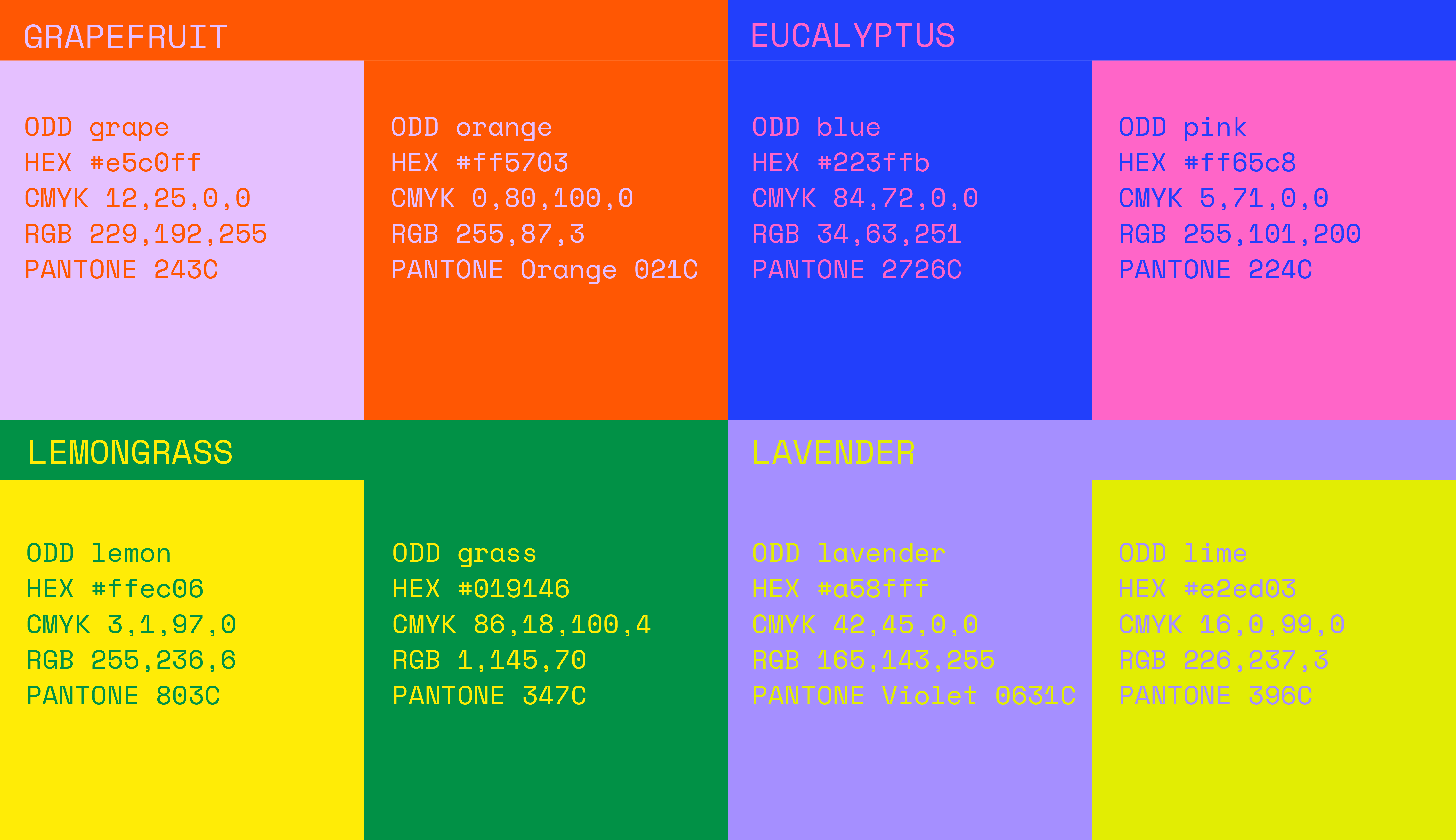
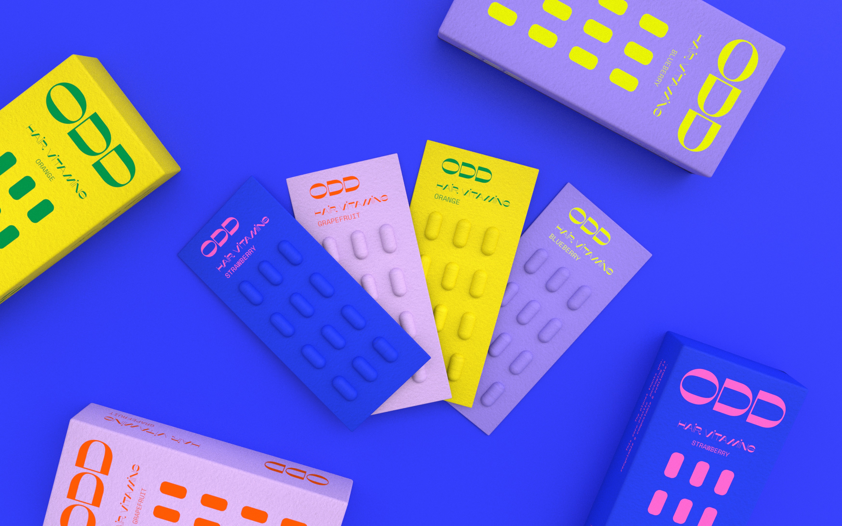
The design process involved a deep dive into color theory, utilizing color coding to aid
user navigation and memory. The aim was to infuse the products with a sense of
playfulness, novelty, and modernity, appealing to the environmentally conscious younger
demographic.
Opening Method
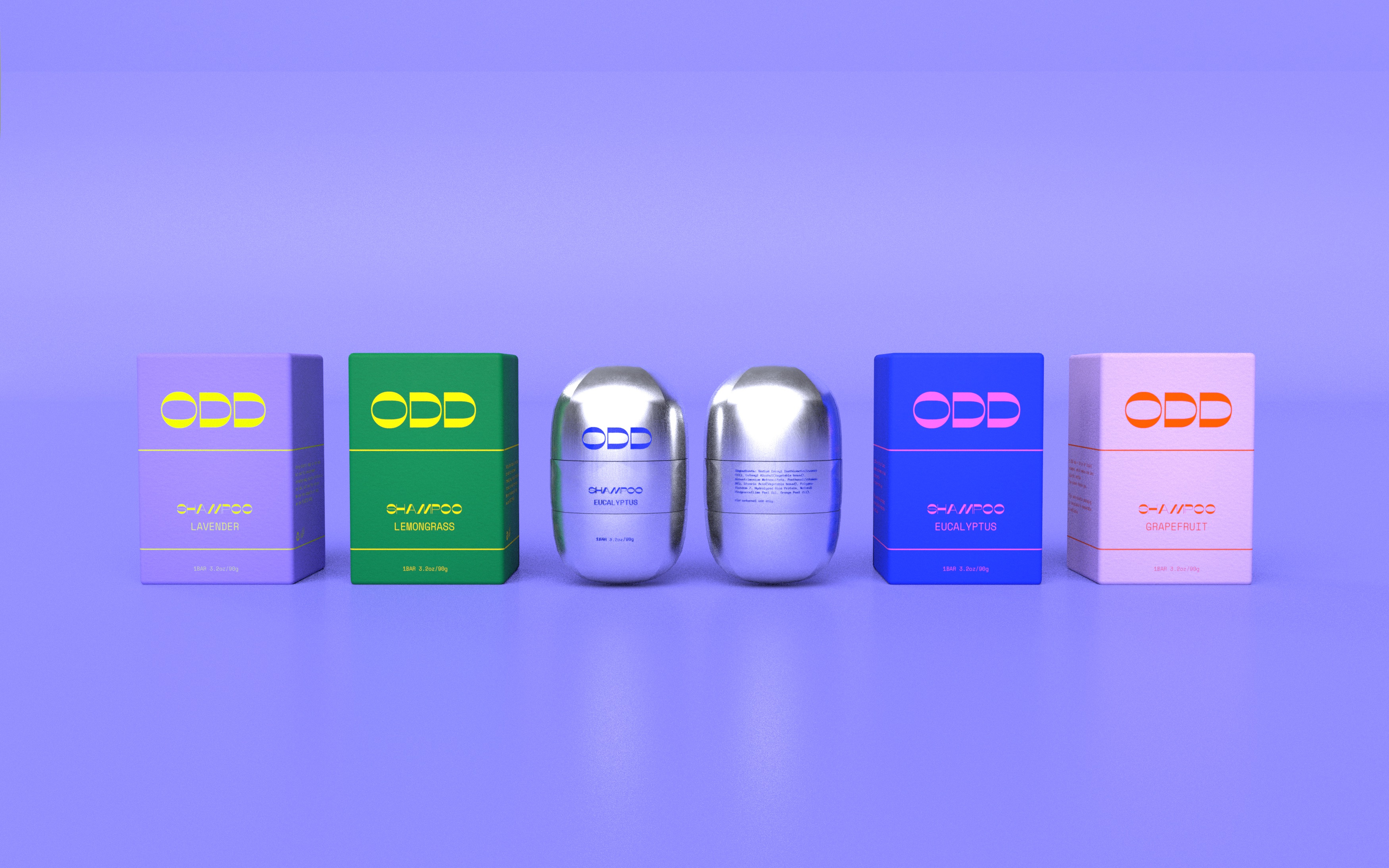
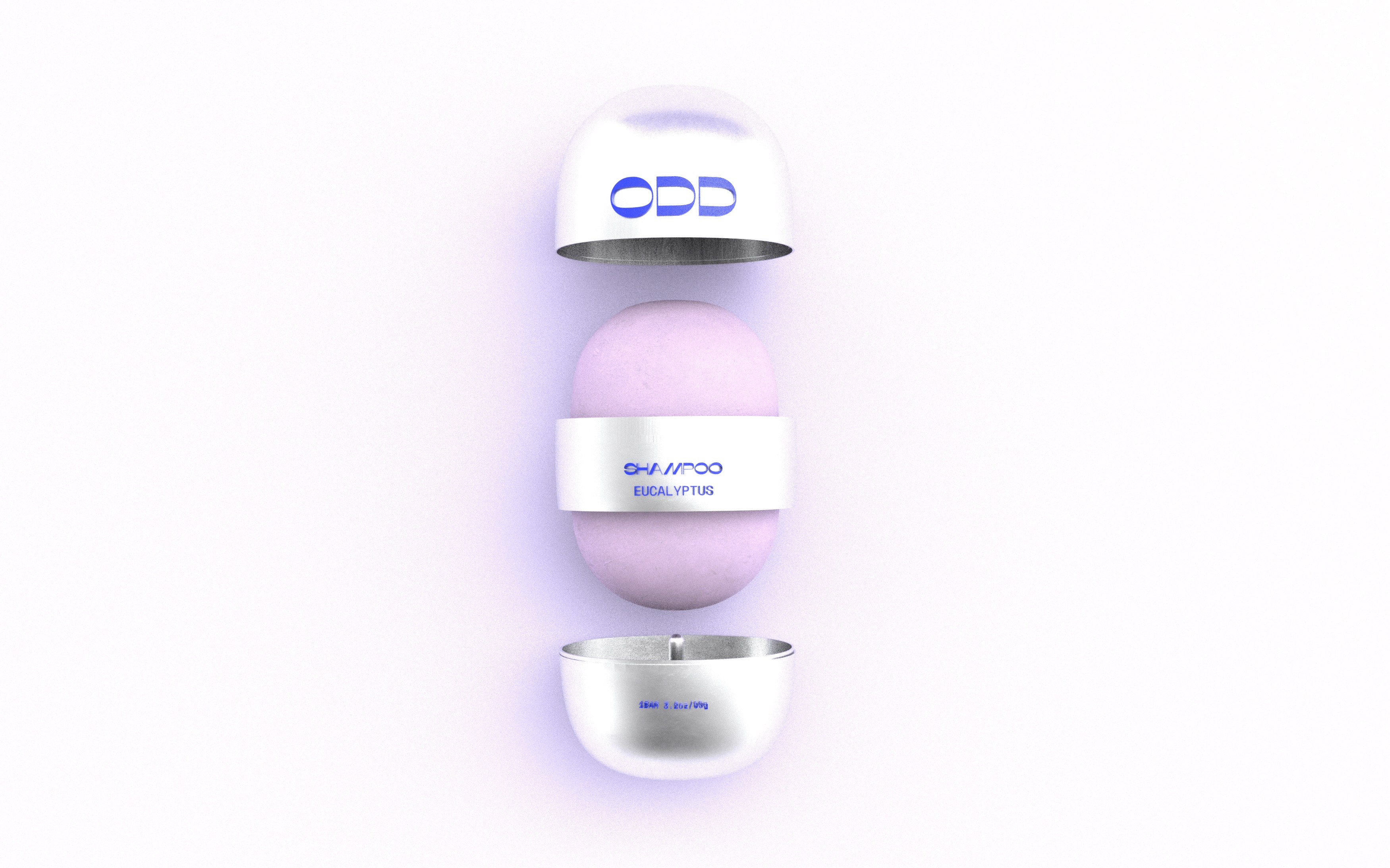
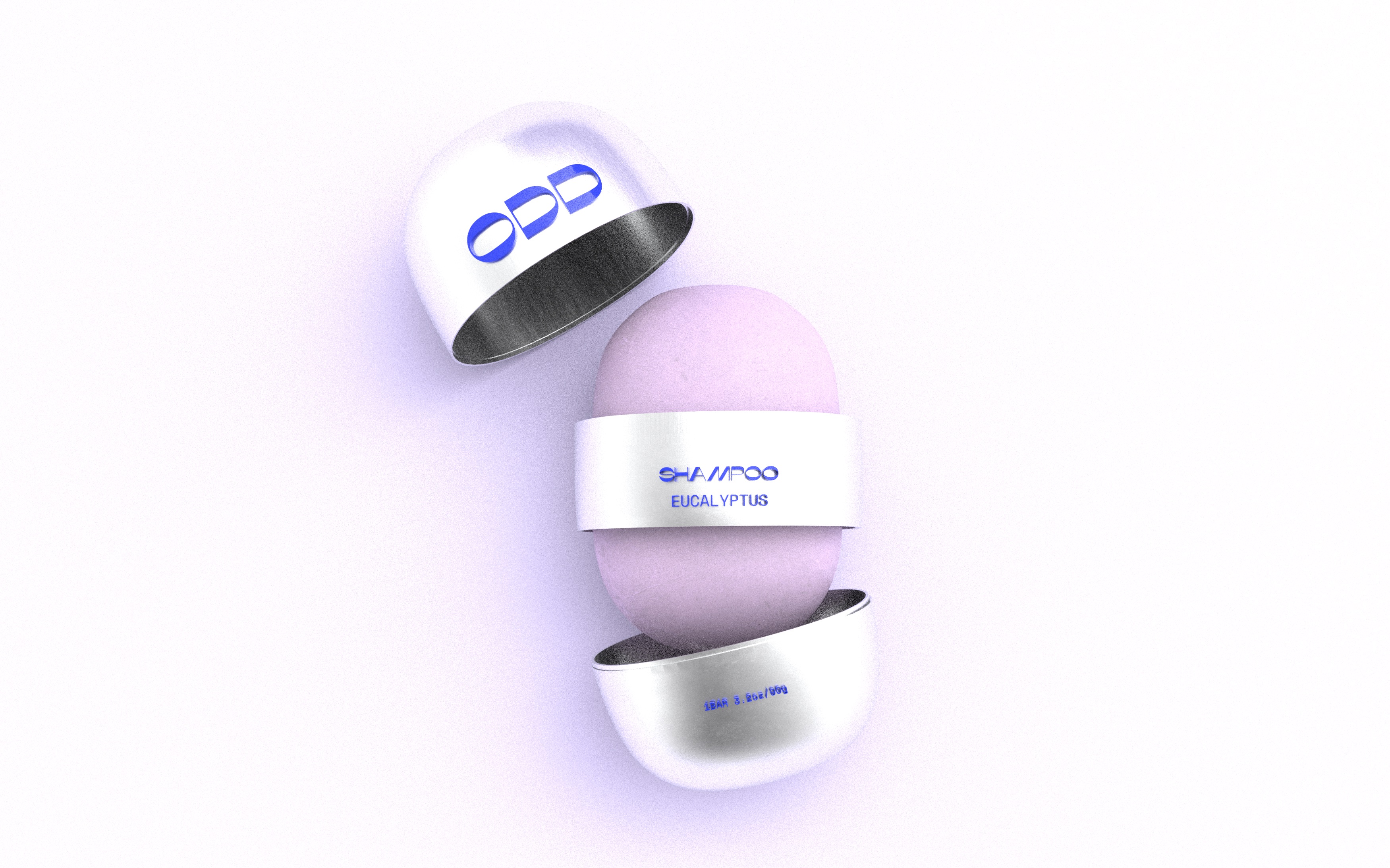
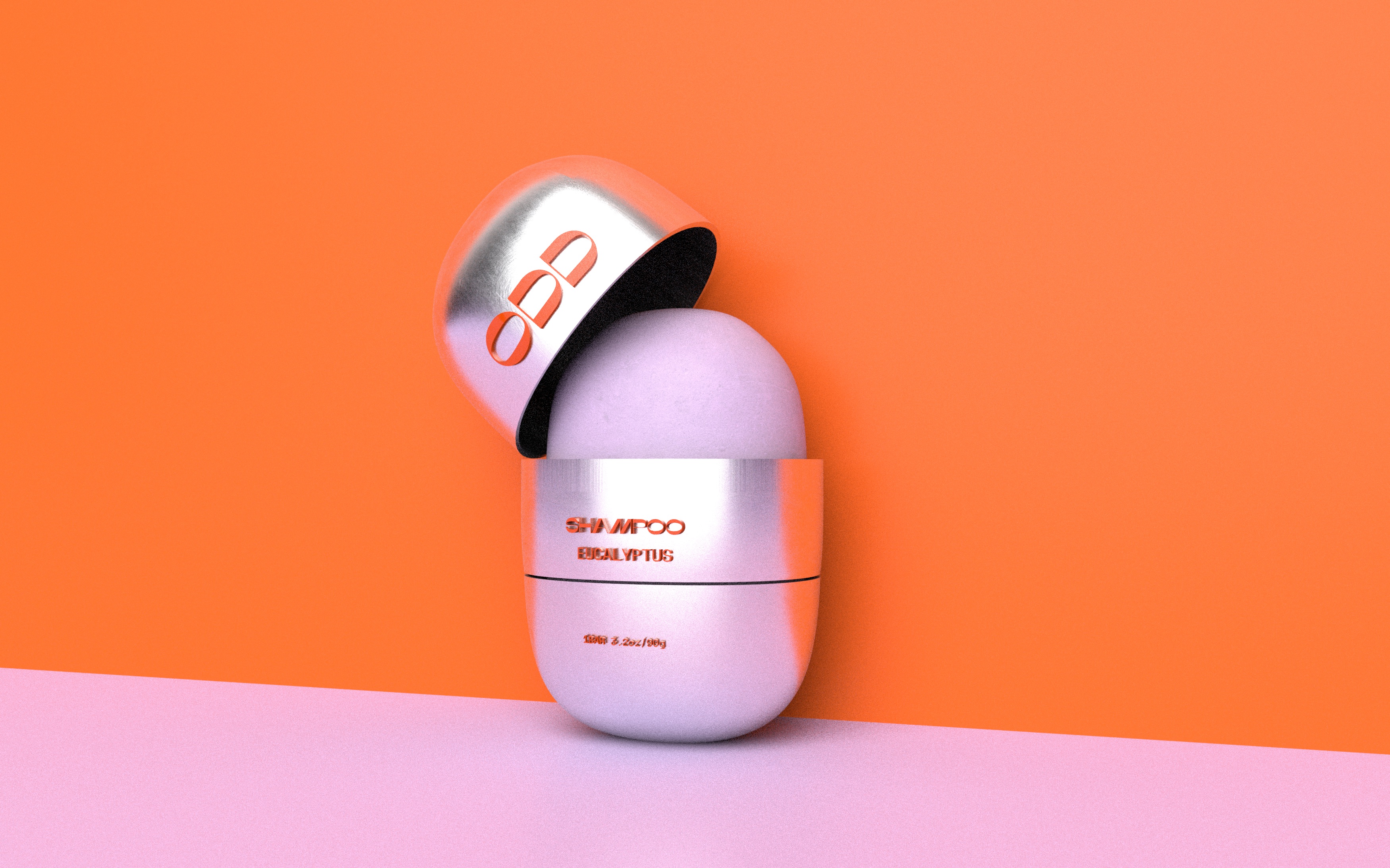
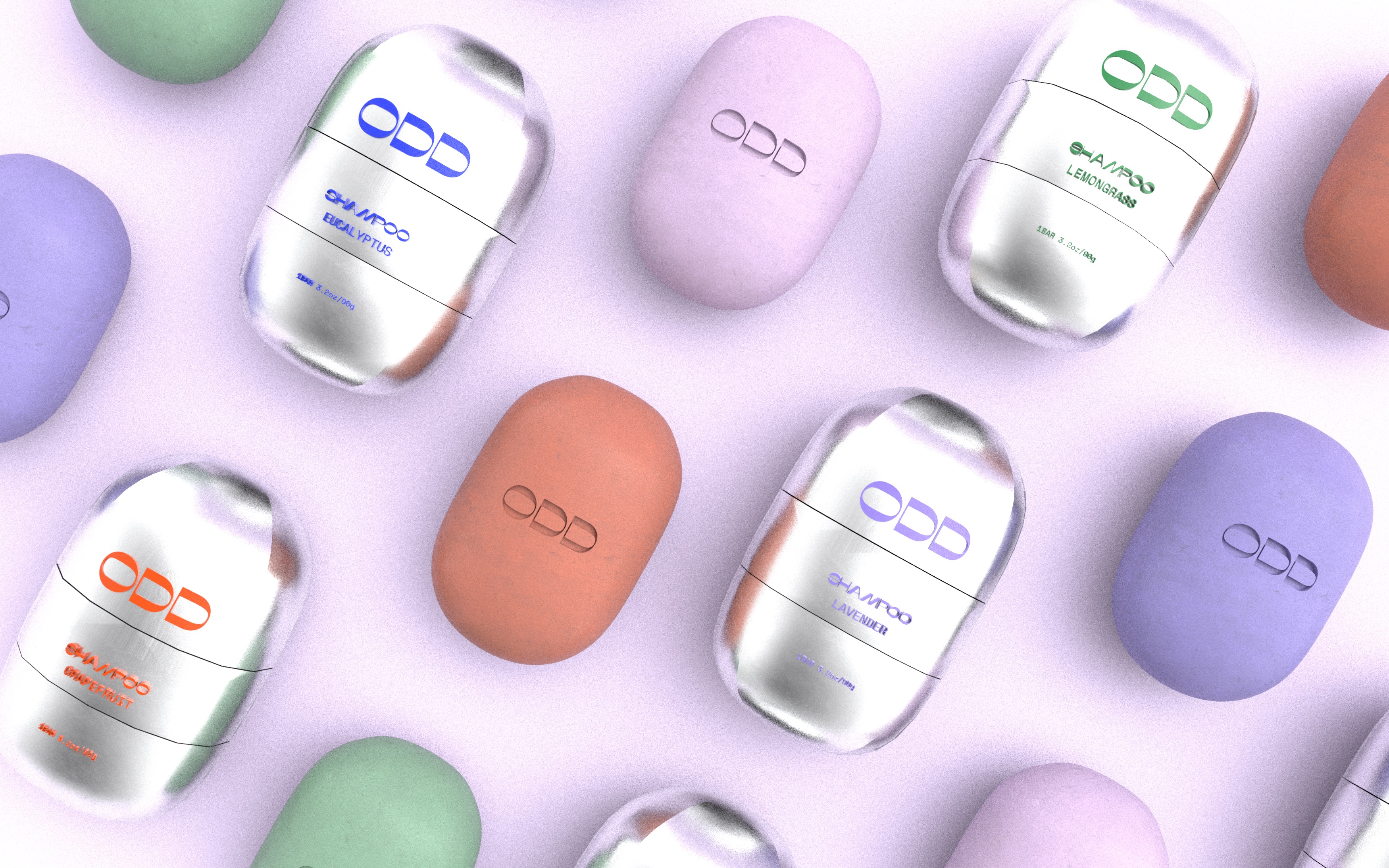
The unique refillable packaging solution with a
distinctive three-level capsule structure and playful, colorful, modern look attract young audiences while protecting the environment by using plastic-free materials. The hero bar packaging form was matched with the counters of the logo
letterforms to reinforce brand recognition.
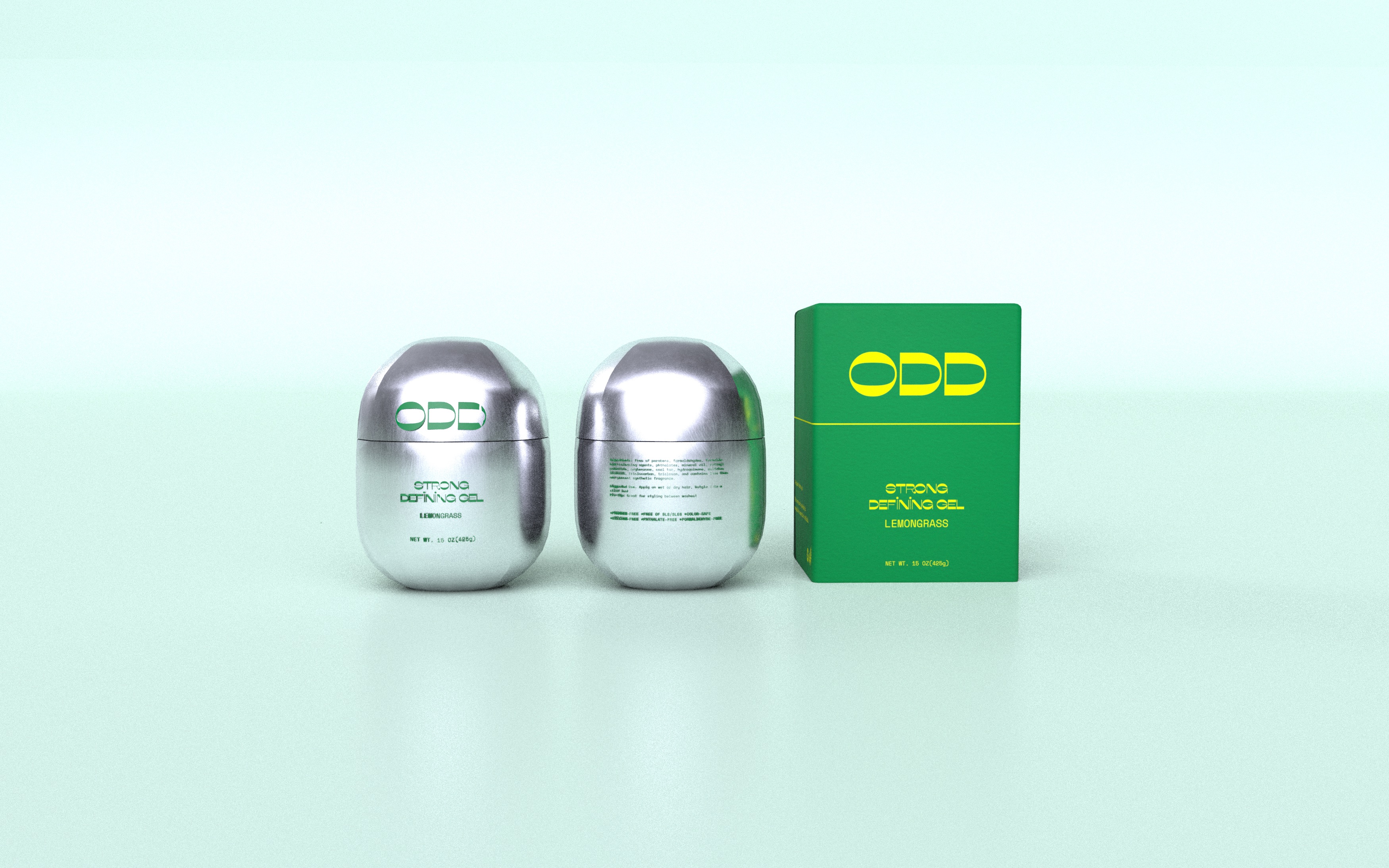
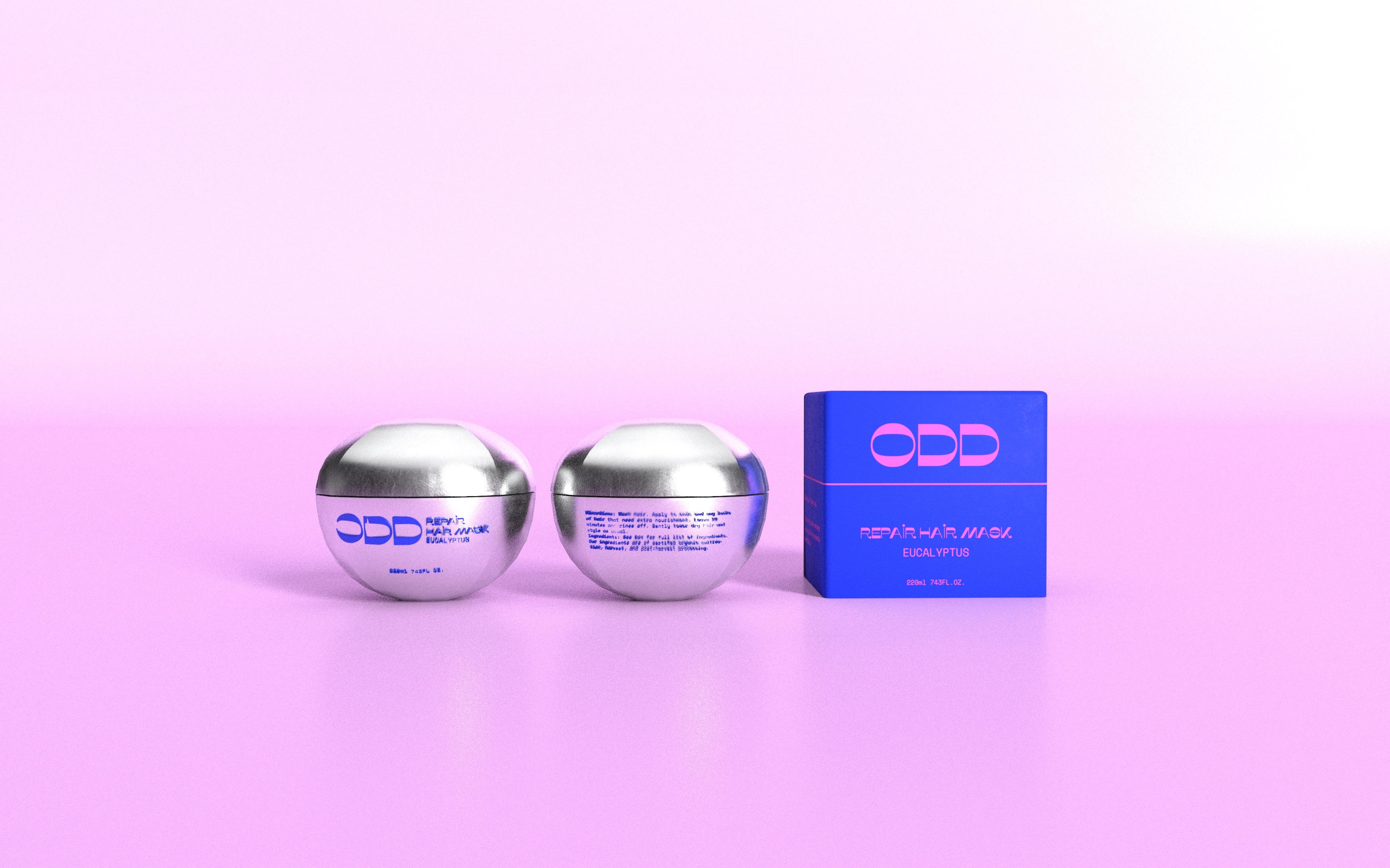
The use of recyclable aluminum not only underscores the brand's sustainability ethos but also lends a futuristic touch, signaling a plastic-free future in packaging.
The use of recyclable aluminum not only underscores the brand's sustainability ethos but also lends a futuristic touch, signaling a plastic-free future in packaging.
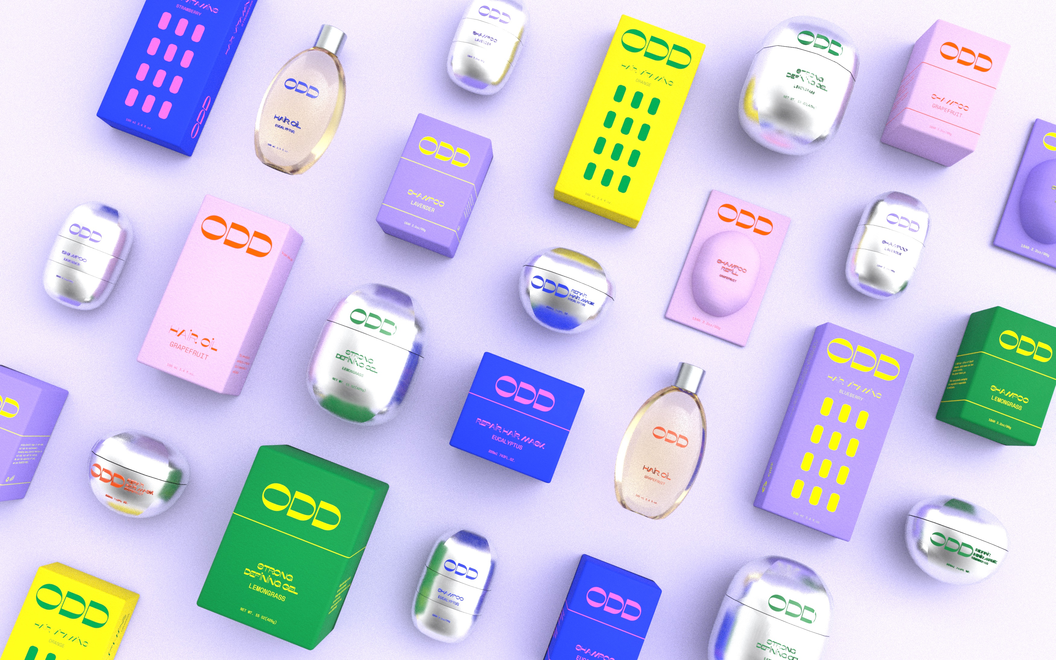
Product Lineup
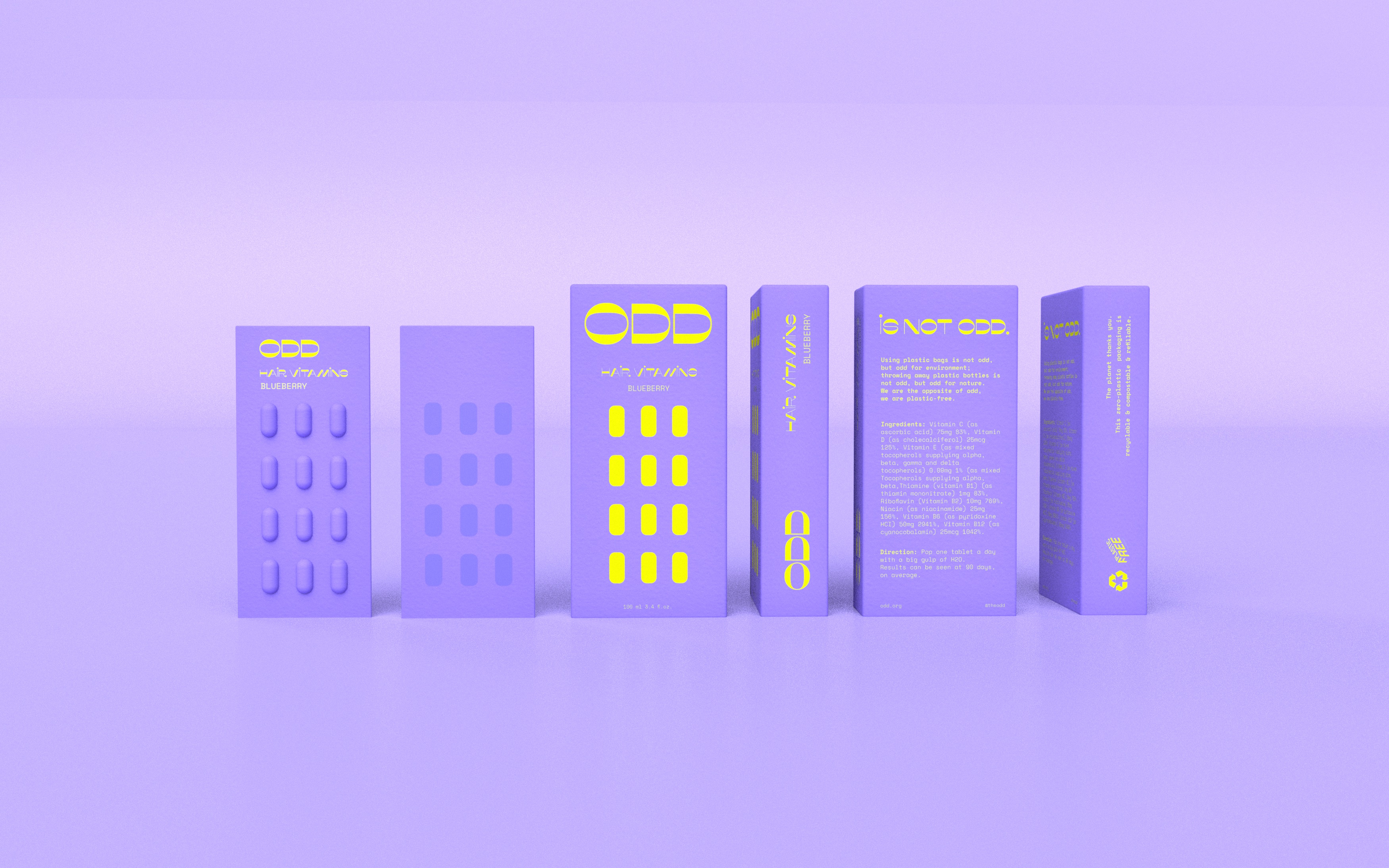
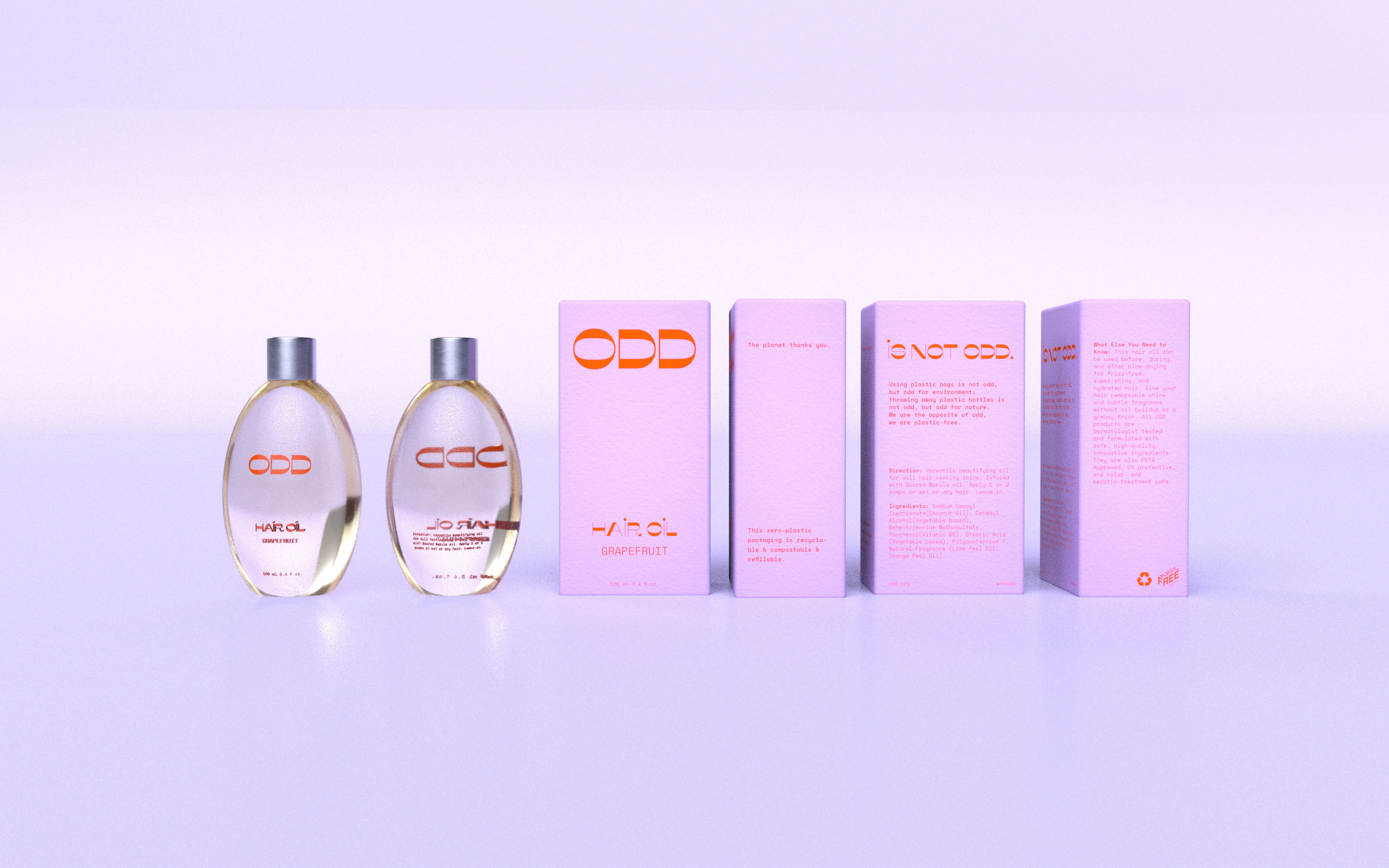
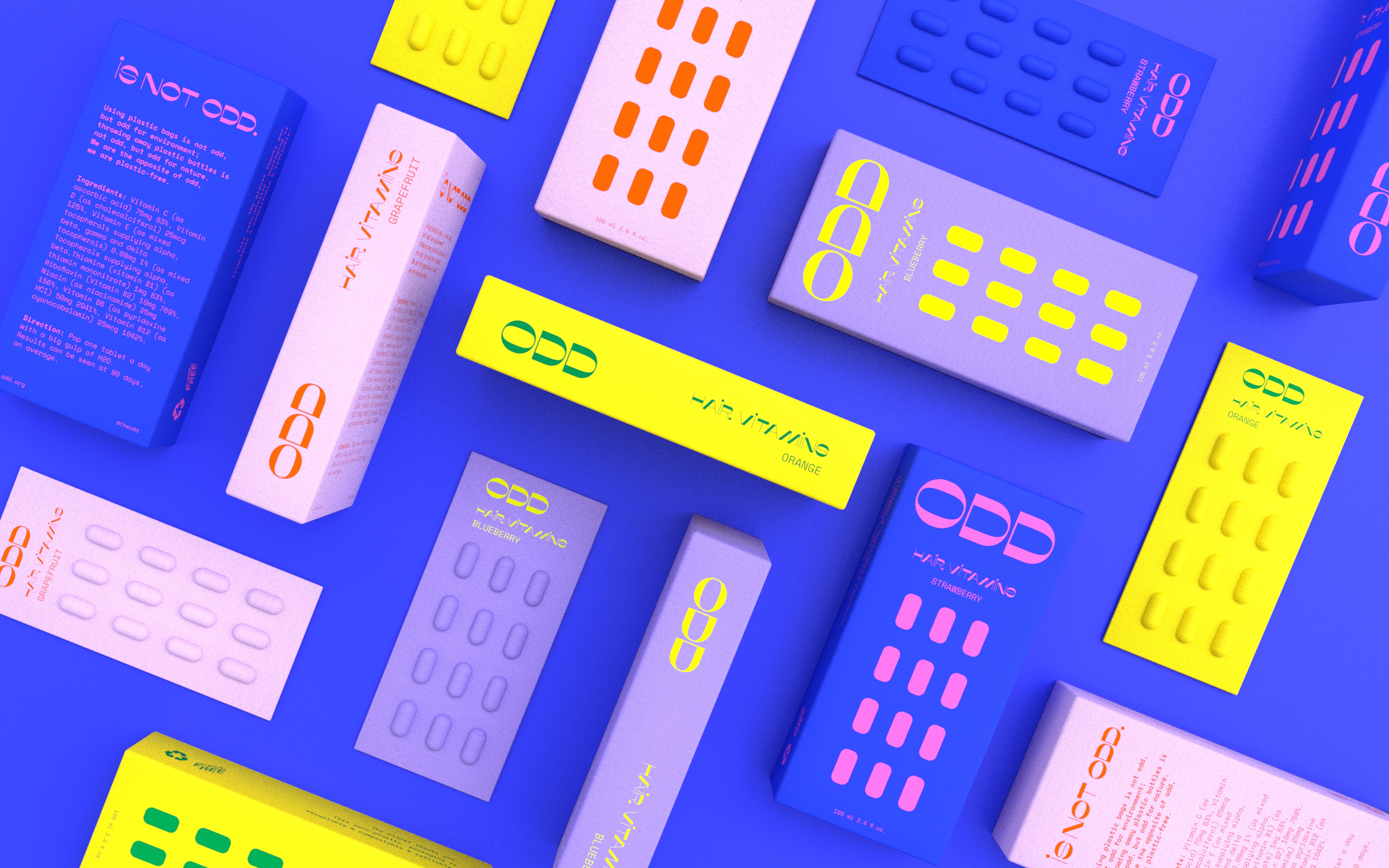
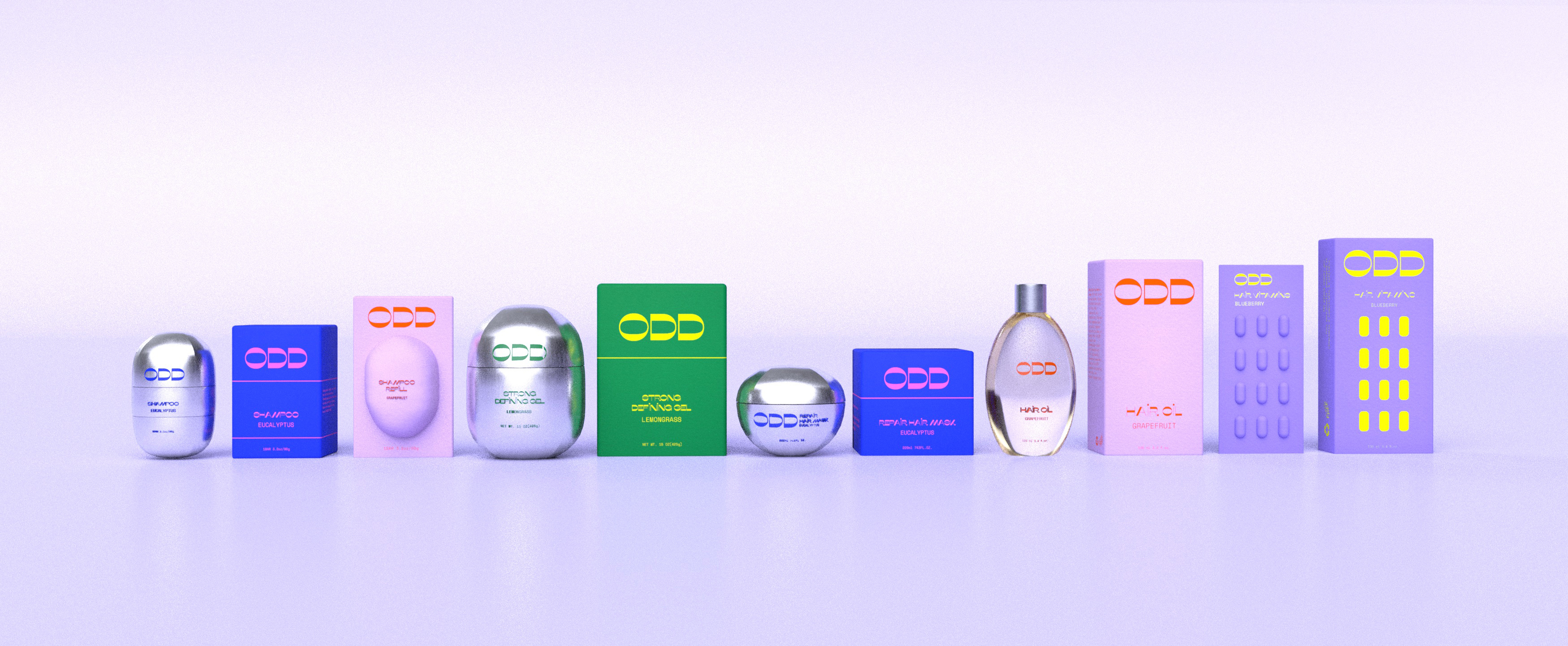
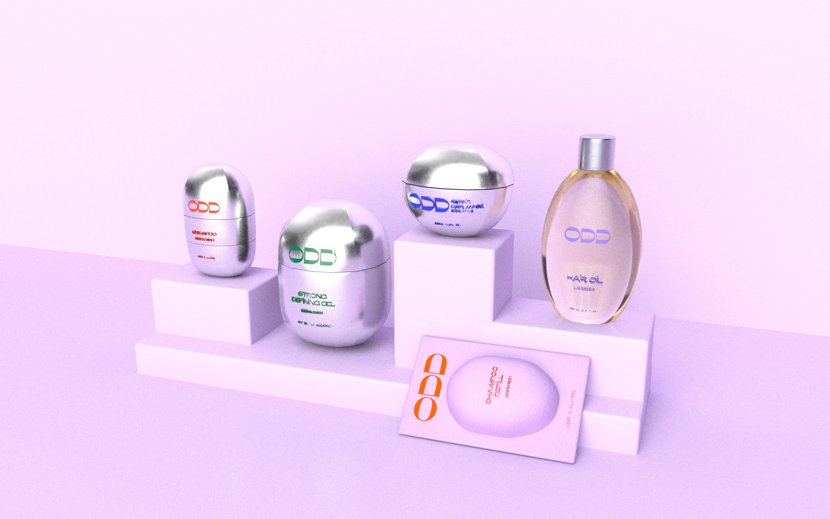
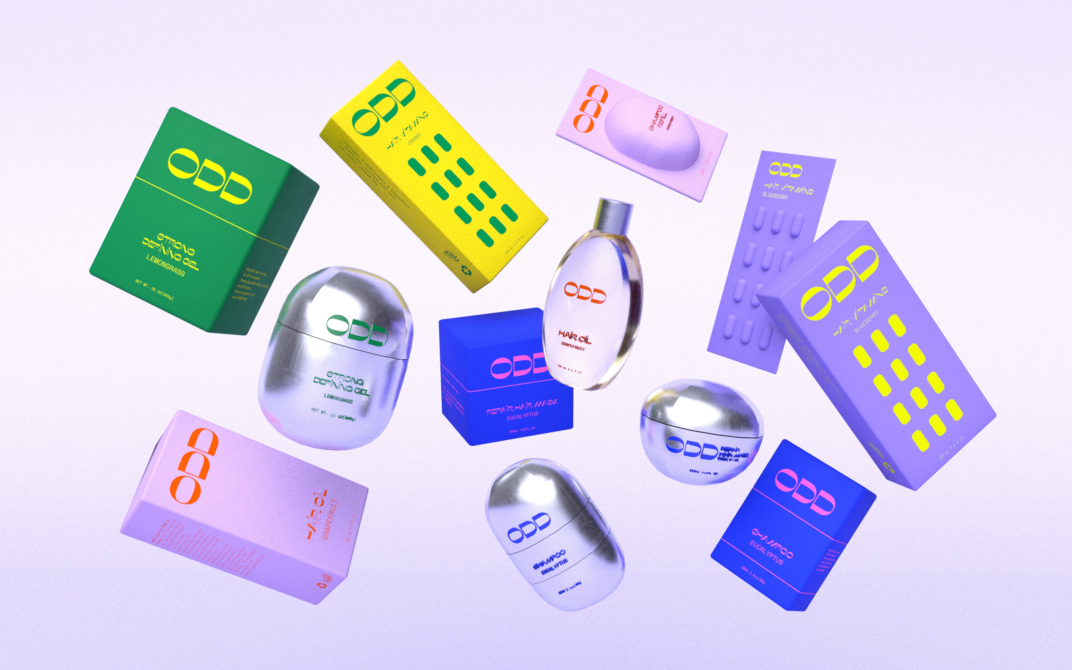
The rounded aesthetic was extended across the entire product range, utilizing recycled paper board and paper pulp for the secondary packaging.

Promotional Posters

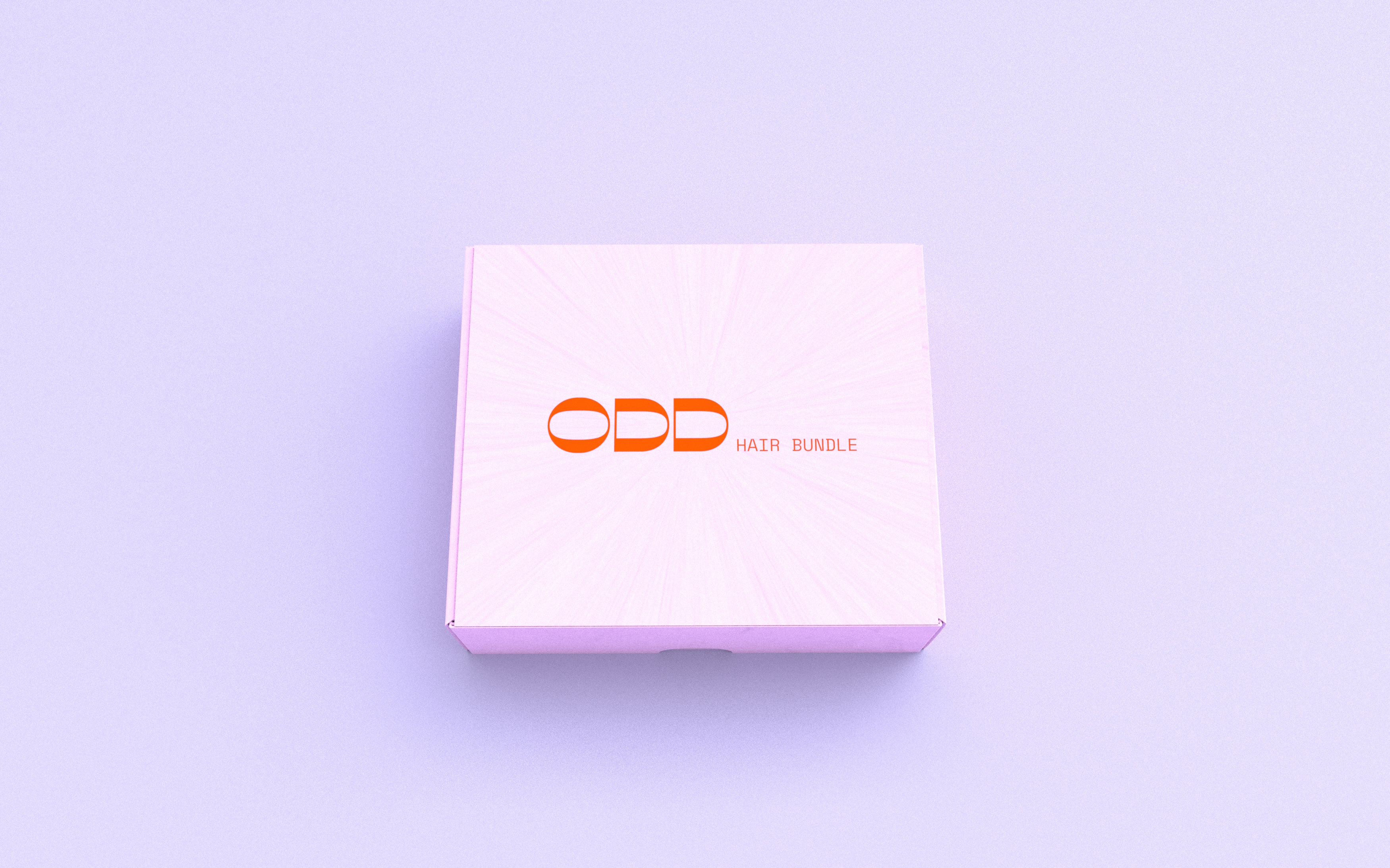
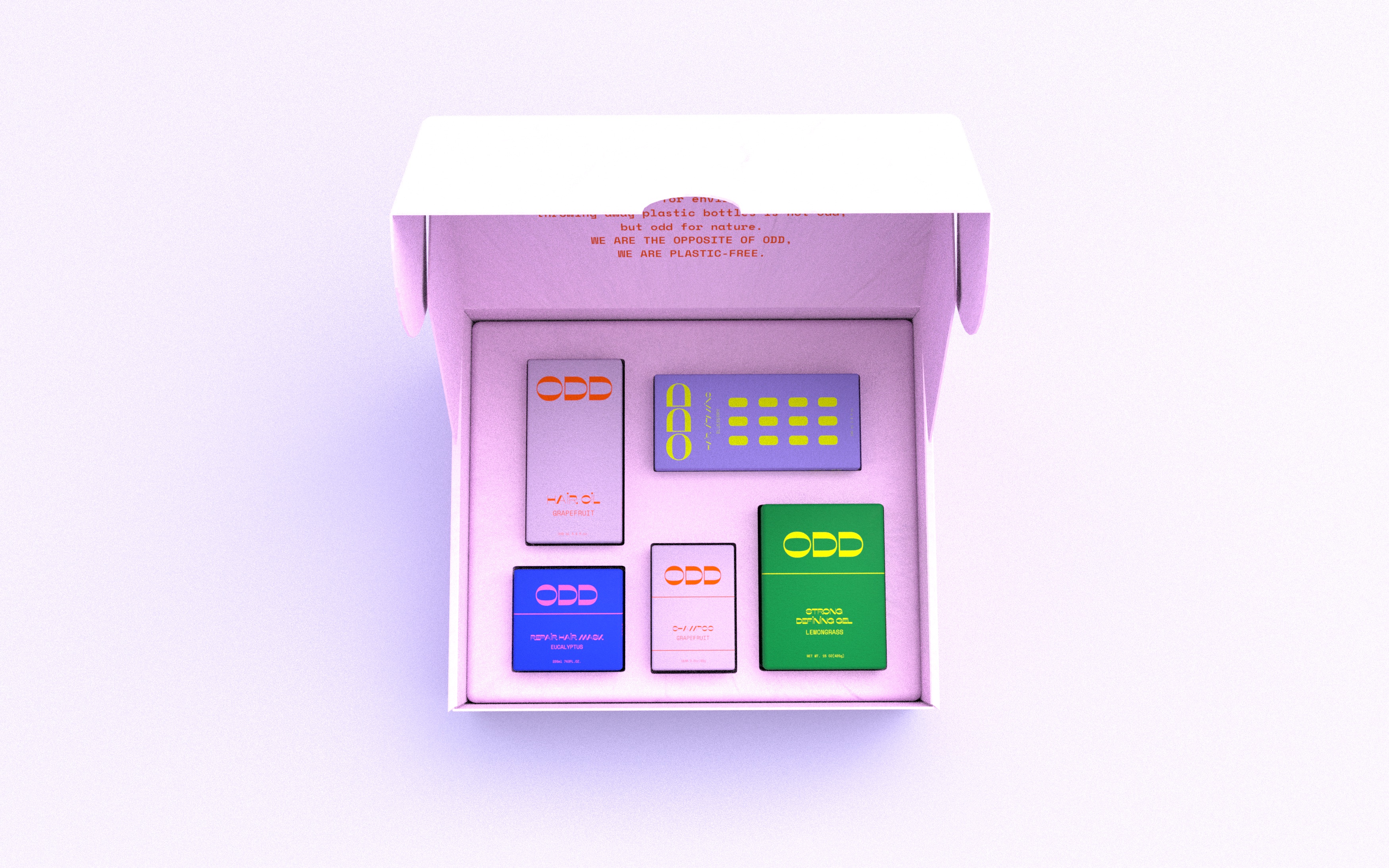
Shipping Box
Product Individual View
